STUDIO SPACE ︎ STUDIO SPACE ︎ STUDIO SPACE ︎ STUDIO SPACE ︎ STUDIO SPACE ︎ STUDIO SPACE ︎ STUDIO SPACE ︎ STUDIO SPACE ︎ STUDIO SPACE ︎ STUDIO SPACE ︎ STUDIO SPACE ︎ STUDIO SPACE ︎ STUDIO SPACE ︎ STUDIO SPACE ︎ STUDIO SPACE ︎ STUDIO SPACE ︎ STUDIO SPACE ︎ STUDIO SPACE ︎ STUDIO SPACE ︎ STUDIO SPACE ︎ STUDIO SPACE ︎ STUDIO SPACE ︎ STUDIO SPACE ︎ STUDIO SPACE
This is a collection of smaller projects, unfinished works, interesting studies and whatever can’t fit into the other main disciplines.
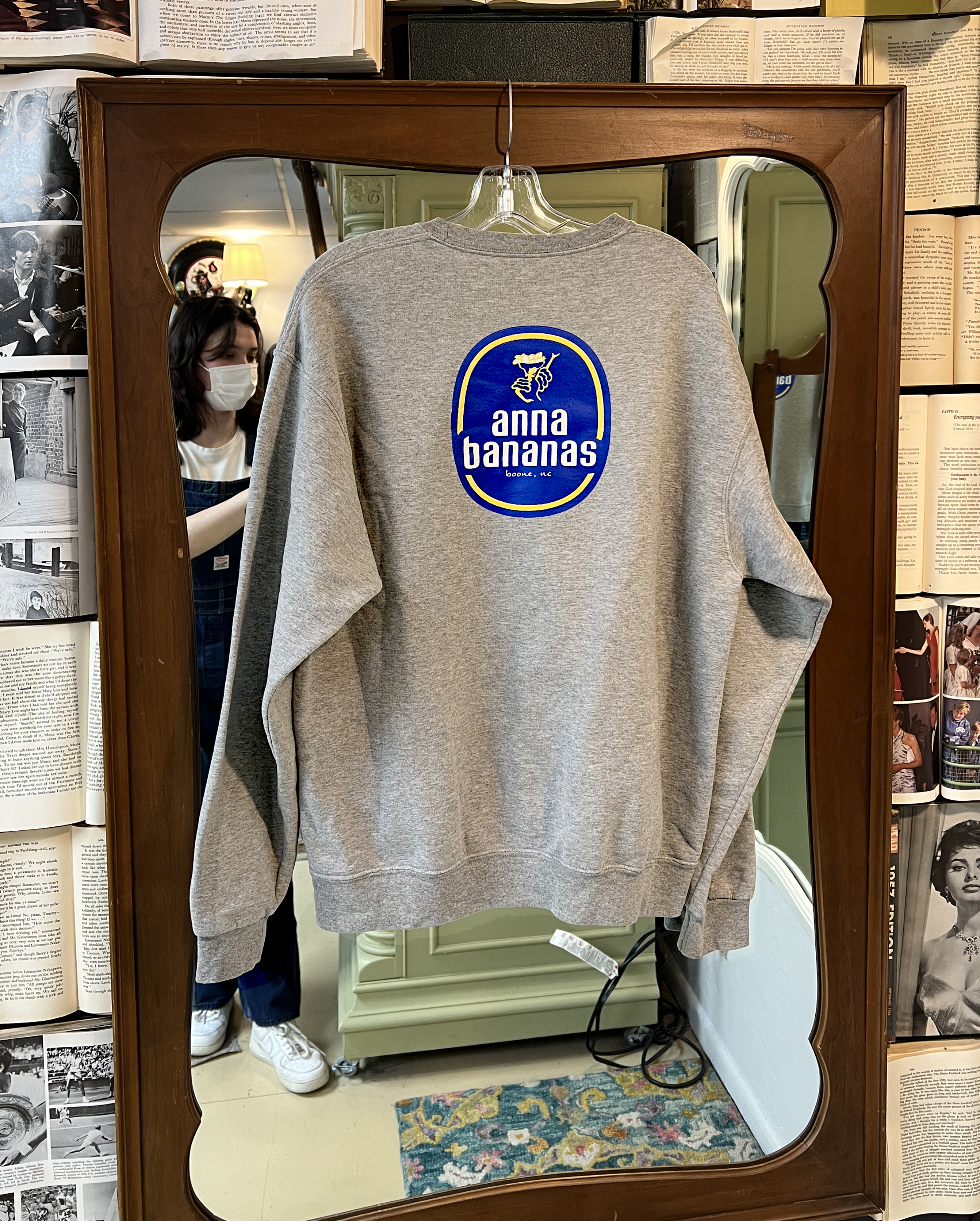
Anna Bananas
spring ‘21 - 23
I was the in house designer for Anna Bananas Boone, in charge of creating promotional graphics, branding kits, merch design and more.
Cardigan
spring ‘20 ︎ crochet
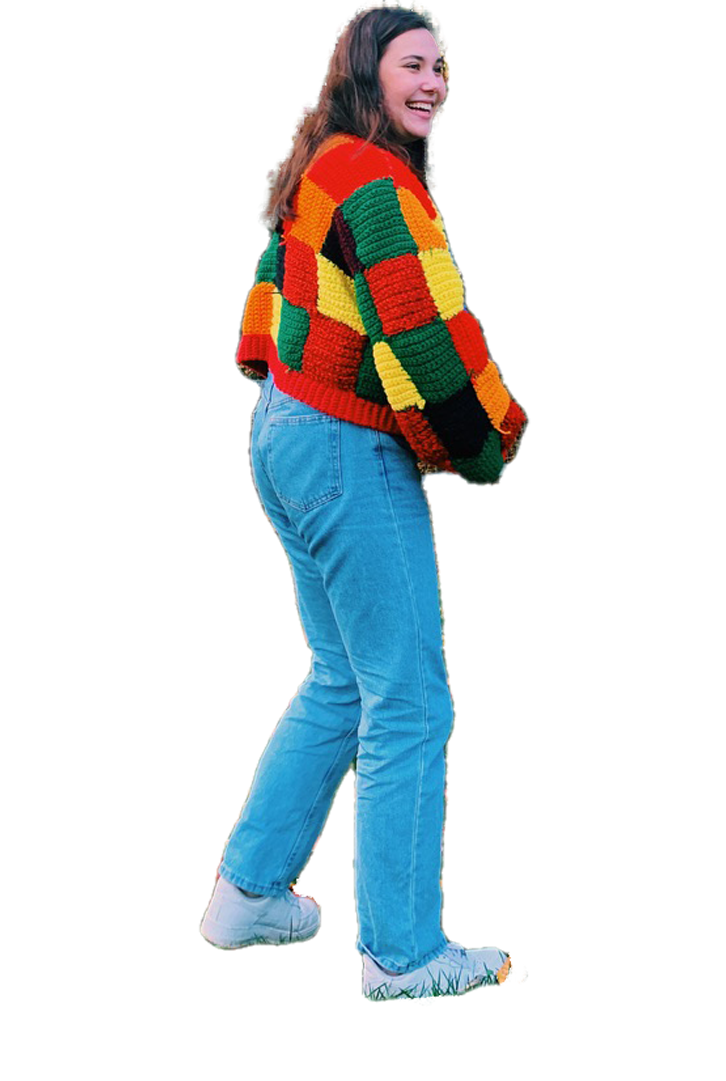
During the first covid lockdown, I rekindled my love for Harry Styles and had the chance to teach myself how to crochet in order to recreate a cardigan that he wore on the today show. Due to the orginal desingers prices and limited quanitiy I was forced to use secondhand materials to save money on the project. After 120ish hours of work, the cardigan was done and posted to my socials, where the original designer saw my recreation and included me in a few videos on their pages.
Xmas Card
winter ‘22
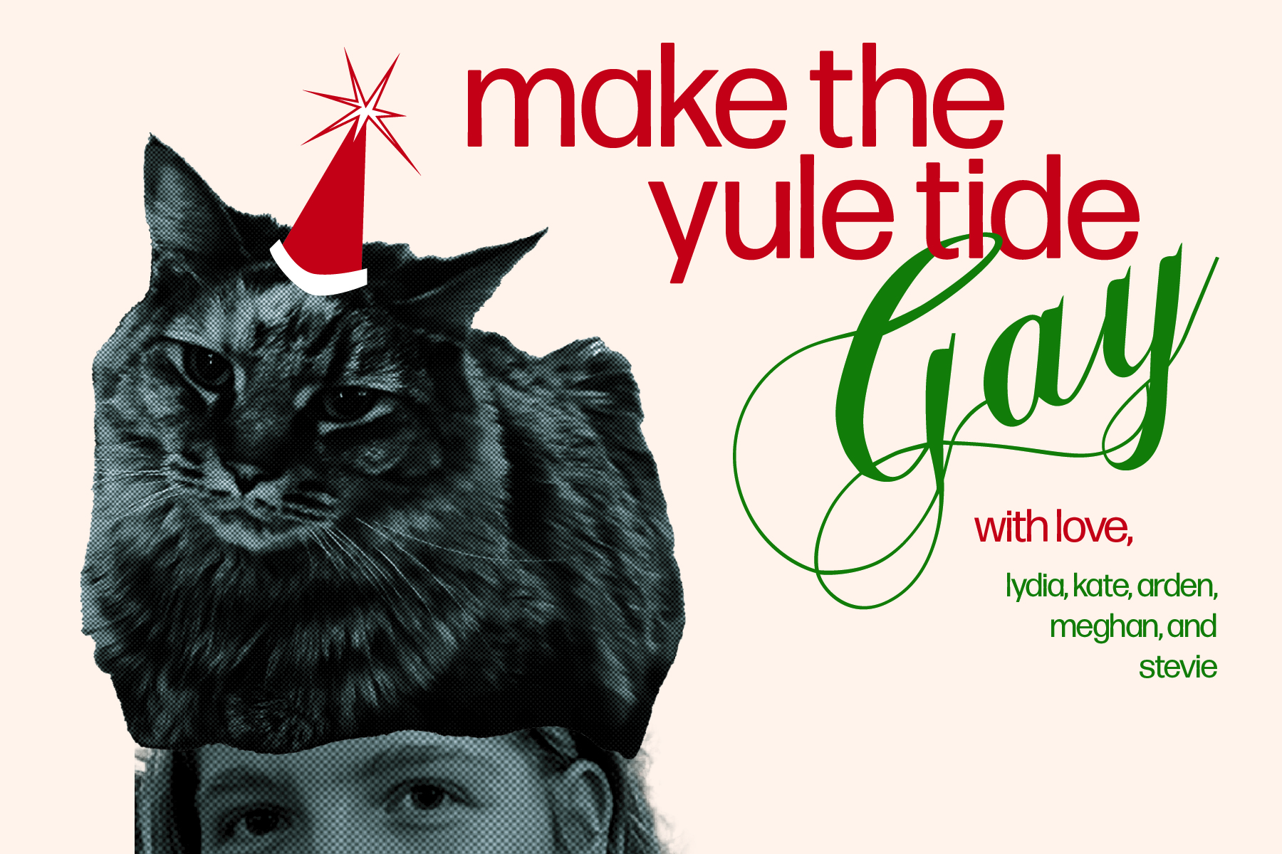
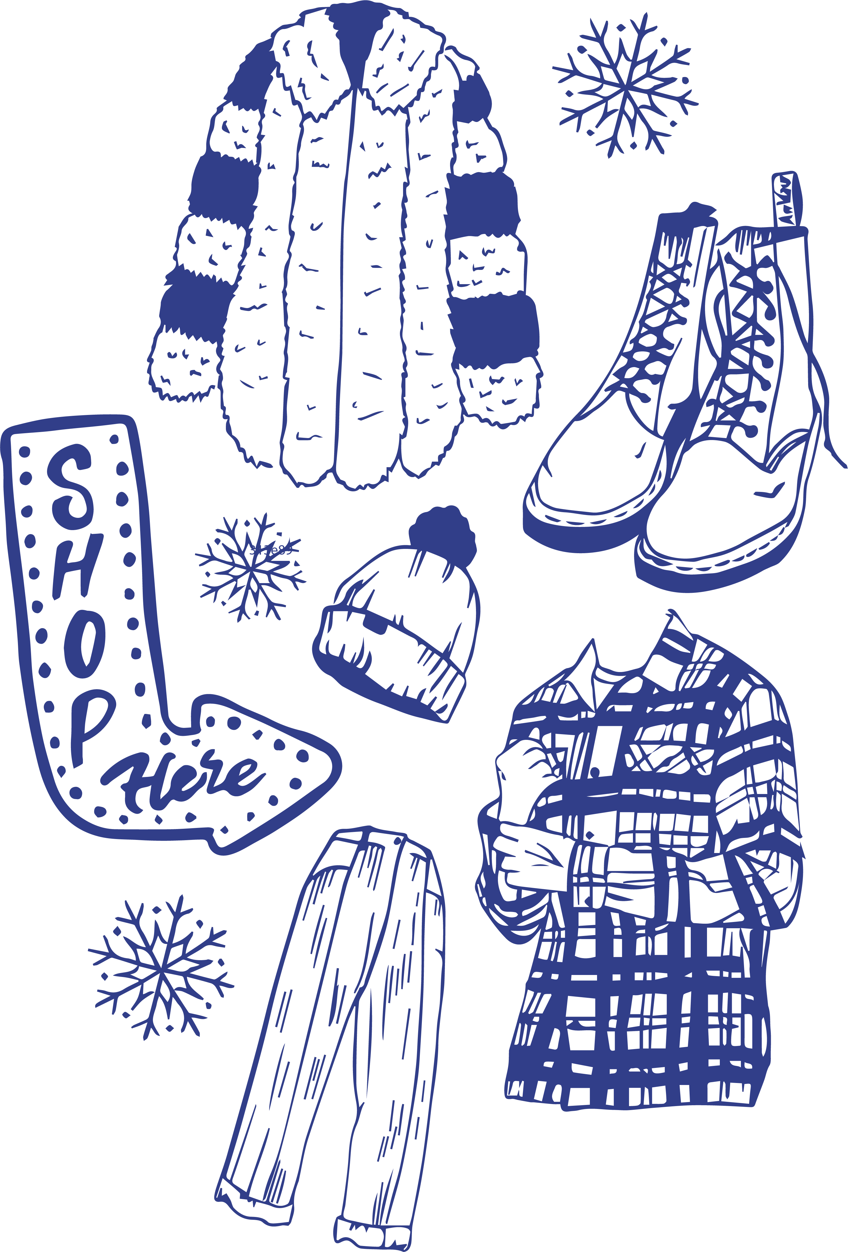
Whie working on the #7DaysOfBadFonts challenge, I chose to design a xmas card for my apartment! The bad font in question is Chopin Script! I had fun making a fake riso effect at home, while learning more about illustrator, and challenging my skills.
Enjoy!!!
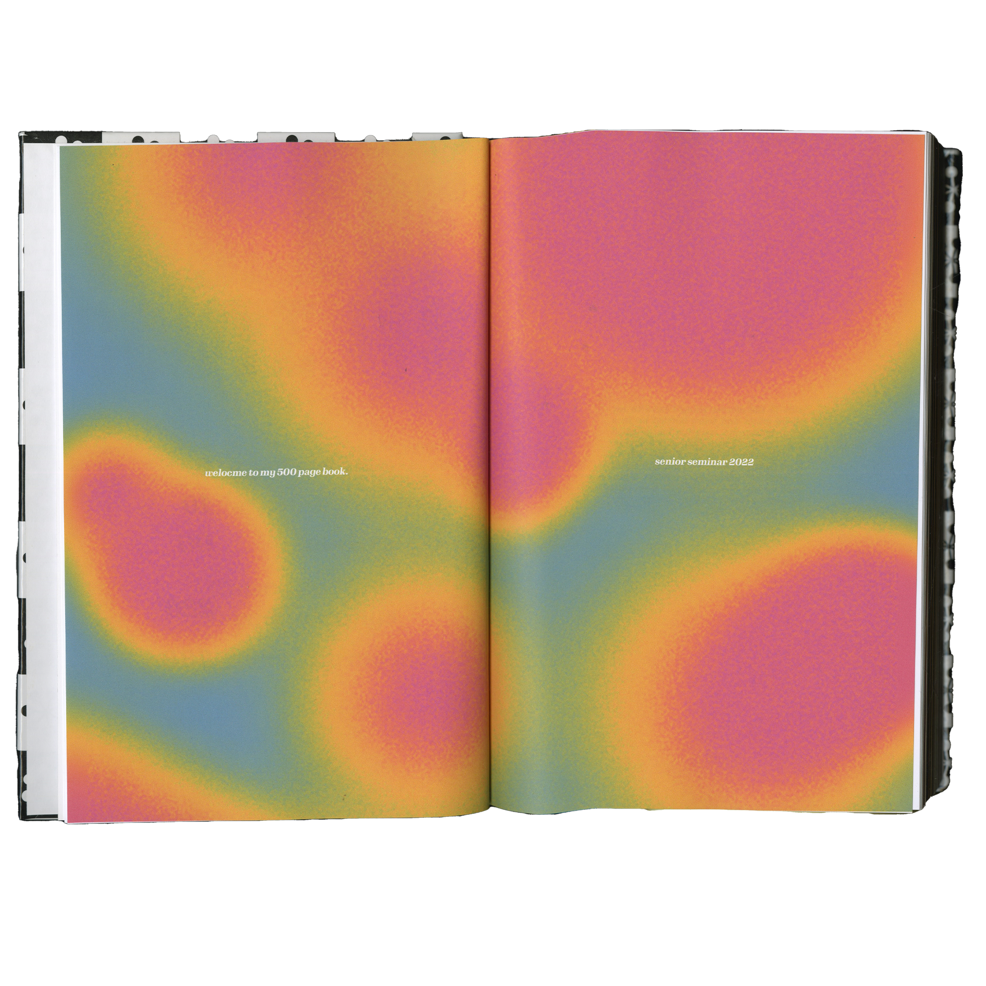
spring ‘22 ︎ indesign, lulu printing
This book explores themes of inspiration in my personal life, design world, and much more, in all of it’s 500 pages. It dives into ideas of community, food, and home, along with visual inspriations, poems, photographs and a multitude of other artifcats.
Stuck in a Heddle
spring ‘23 ︎ riso printing, photography
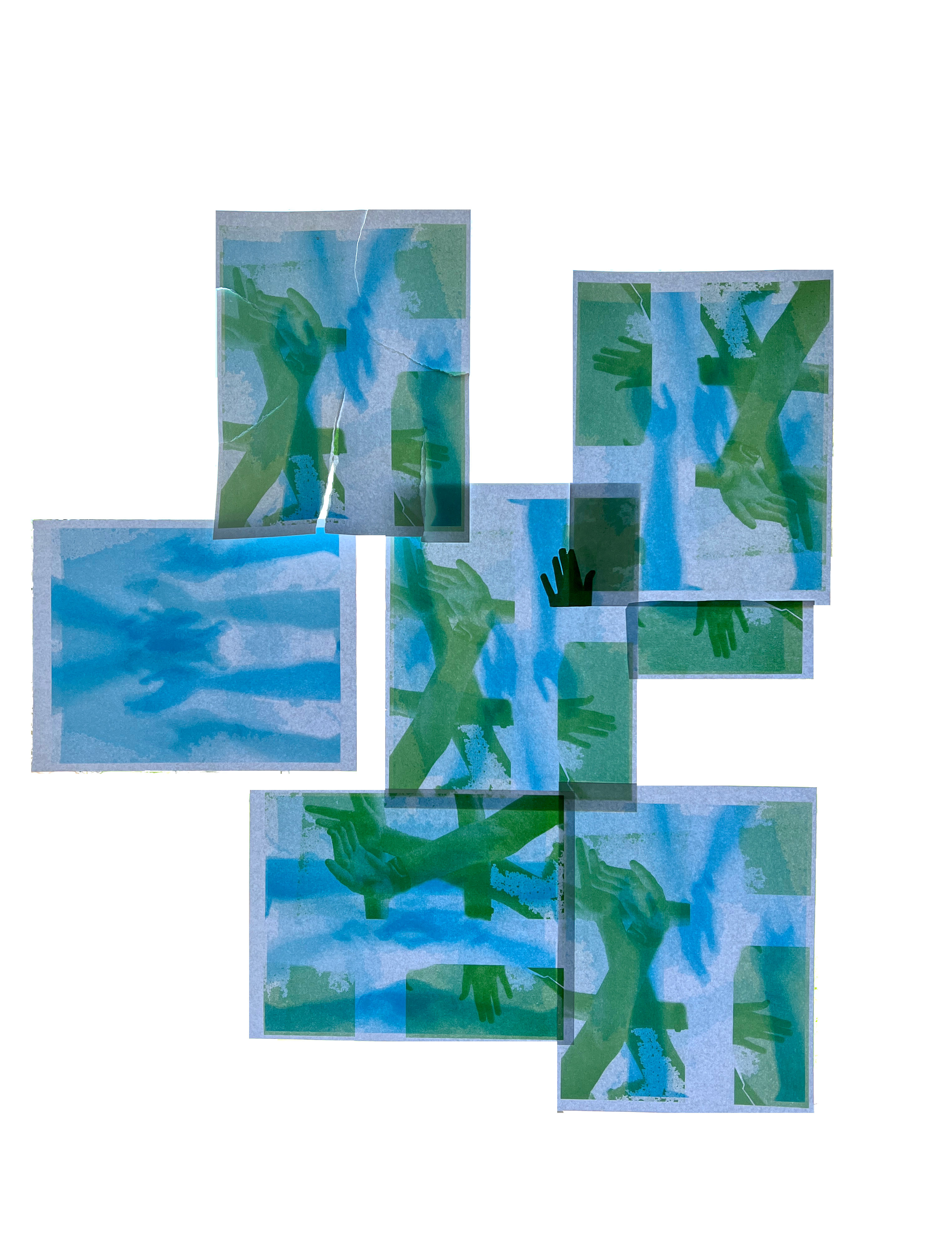
This installation speaks to the difficulties faces during the weaving process through the lens of printmaking and movement. Pages were printed on each side and insatlled in a window to let the light shine to reval both images. Due to the location, aqua and green were the chosen colors to mimick the blue Boone sky and green trees of the “Beach” (our buildings courtyard area).
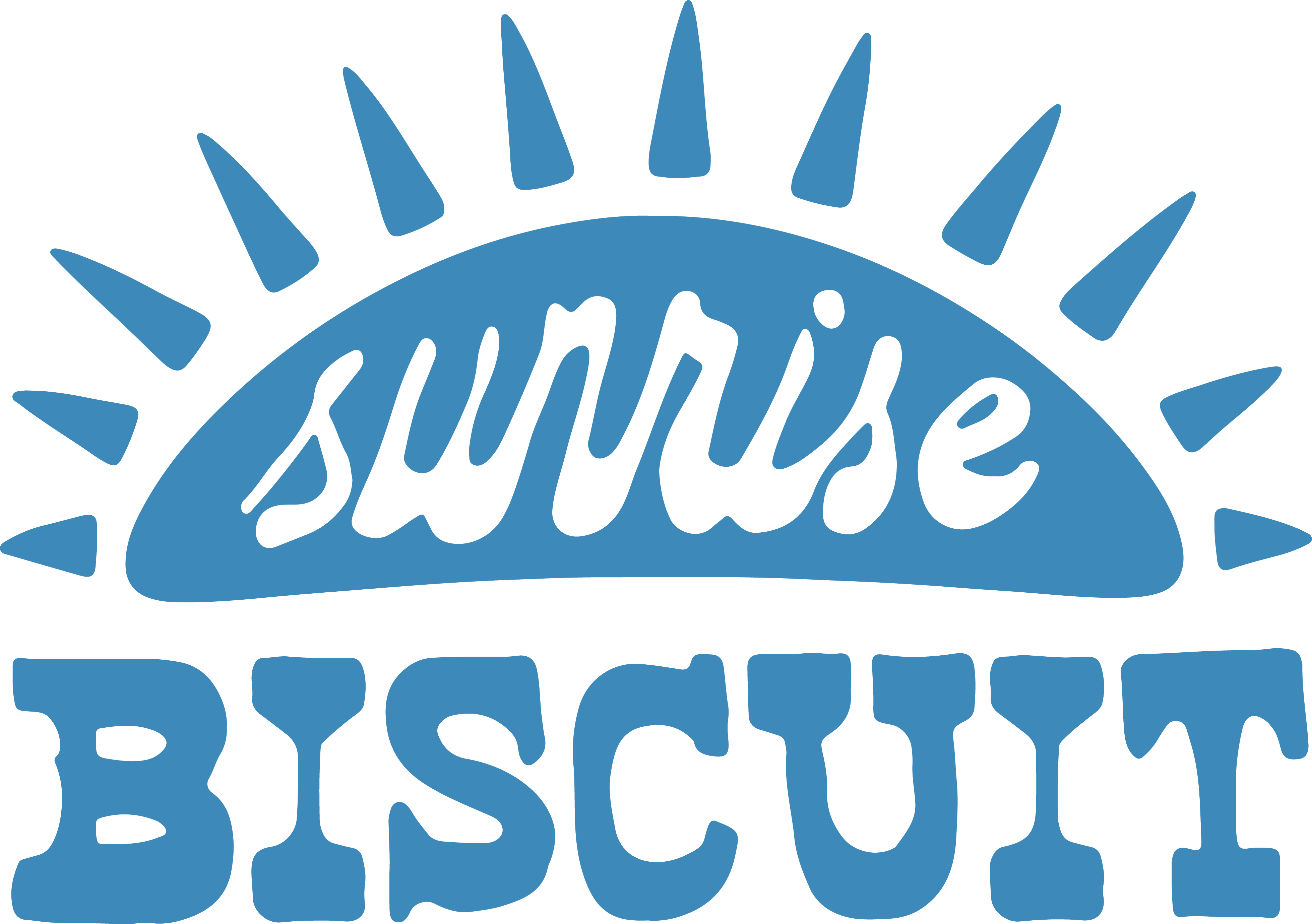
Sunrise Biscuit Rebrand
spring ‘23 ︎ indesign, illustrator
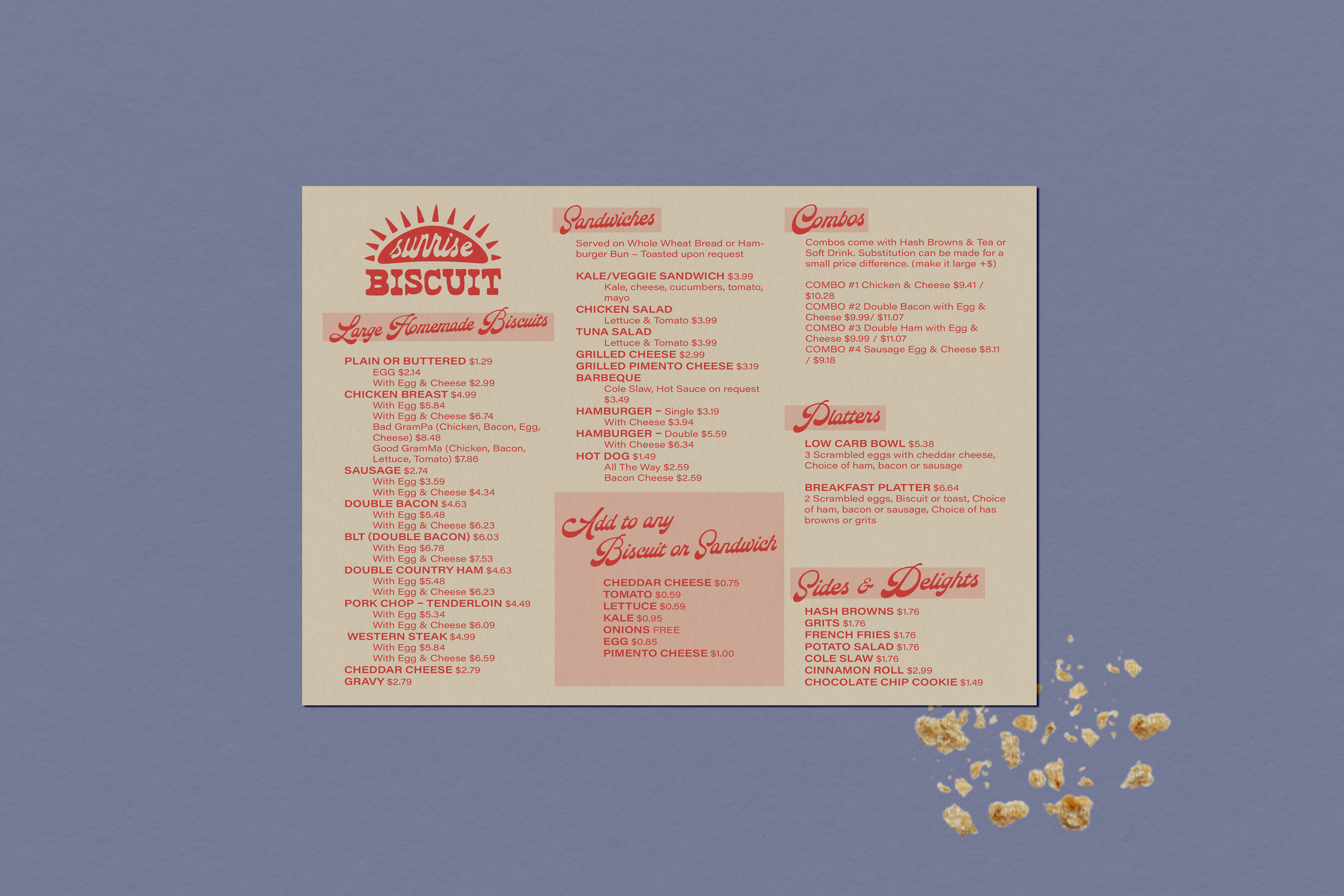
This mock rebrand for an iconic local breakfast hub was a great exercise in brand redevelopment. I practiced creating a strong visual idenity to pair with a brand that already has a solid voice in the community.

